Prometheus
-
Content Count
56 -
Joined
-
Last visited
-
Days Won
4
Everything posted by Prometheus
-
I strongly disagree. Being on top is a good thing and what we want to communicate. Being the stronger, the one in control, having the upper hand, constantly scanning the fields and seas below for prey. Looking up implies being cute, weak and begging. And a tern is hunting for fish all day long and that means looking down a lot. You don't build a fort in a valley, but on a hill, in order to take advantage of gravity and get a birds view of things below, and be the ones on top, in control of the situation. Birds don't look up unless they are on the ground nesting or injured, and it is perhaps
-
Here's another one with Freicoin written in full width Here's a few others, half width: or It can be adapted to just about any relevant format, or medium, for that matter if anyone decides to print it on anything or cut it out in vinyl or have a shirt embroided. Or you might find it like a sticker on a cash register or at the storefront of an online site accepting FRC payments: or with some more cowbells: There are tons of possibilities, and a simple design manual would naturally open up for later adaptions, by limiting typography to a certain font and a few illustrations
-
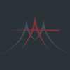
Hi, Bicknellski. Yes, I can see my previous bird looked like a pigeon, did some more research into terns and made some doodles and this one here came about: I know, old school and kind of boring, and the left or right or well its wings doesn't feel right. Anyway, I kinda liked the way the head turned (or terned) out, so... This one here is by far the best balanced of the ones I tried. I know it isn't square/circular, and I tried out several other compositions, like the ones below. Of course it could be made to fit in a circle, but who said coins were round anyway?; one could fit it wi
-
Over at the Freicoin comminuty forum there is a thread about a wish for a new logo for Freicoin. Inspired by Fedde who directed me to that thread and the thread itself, I put together the one below, and it's just a sketch, and needs more: Another one is a variant of the two former ones, the coin-looking FF coin (the typography) and the Blue see-through Kria logo: It works.
-
Great board! Go Fedde!
-
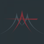
New design including the new kria coin in the logo. Wiii!