
Prometheus
-
Content Count
56 -
Joined
-
Last visited
-
Days Won
4
Posts posted by Prometheus
-
-
Here's another one with Freicoin written in full width
 Here's a few others, half width:
 or
or  It can be adapted to just about any relevant format, or medium, for that matter if anyone decides to print it on anything or cut it out in vinyl or have a shirt embroided.Or you might find it like a sticker on a cash register or at the storefront of an online site accepting FRC payments:
 or with some more cowbells:
  There are tons of possibilities, and a simple design manual would naturally open up for later adaptions, by limiting typography to a certain font and a few illustrations showing proportional limits and composition, spot colour values and so on. The most important thing is consistency and being loyal to your brand's design manual.I always had a rule when I used to work with this kind of things, and that's basically that a logo must work in black and white, and I used to keep an old depleted fax machine in my office for effects and fail-proofing of logos and visual drapery.Or how about
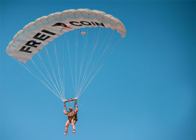 or perhaps...
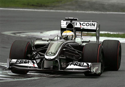 or what about...
-
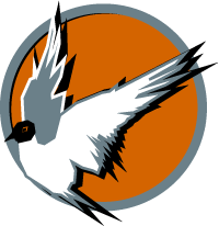
Hi, Bicknellski. Yes, I can see my previous bird looked like a pigeon, did some more research into terns
 and made some doodles and this one here came about:
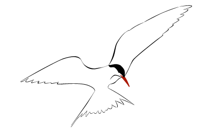
I know, old school and kind of boring, and the left or right or well its wings doesn't feel right. Anyway, I kinda liked the way the head turned (or terned) out, so...
This one here is by far the best balanced of the ones I tried. I know it isn't square/circular, and I tried out several other compositions, like the ones below. Of course it could be made to fit in a circle, but who said coins were round anyway?; one could fit it with stars and make it look like all the other coins out there, but I think the circle is a distraction altogether. Or what do you guys think?
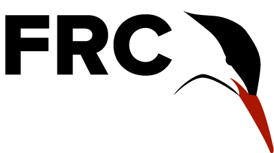
Also -- even if scaled down to fit a world of ants it's still perfectly readable, and you can easily identify the tern. Here's one in 20px height for you (I was unable to resist the desire to paste up a whole row of them)...

It doesn't say coin or Freicoin straight out either, but the acronym must be communicated at some level anyway, so I thought I'd give it a try. Looks rather mean. Then again, I guess the Kria kicks what Americans call 'ass'. AND there's a bit of an easter egg here too (egg, proper), if you detach your vision you might detect a shark or two or perhaps it's a killer whale, and there's even a fire spitting dragon-like abstraction, and they all look cool and rather in tune with it all. Quite a few abstractions for a total of four pen-stokes if I may say it myself.... Quick turn back: The logo somehow hints of balls and stubbornness, being on top of things perhaps even, I mean, isn't this coin supposed to conquer the world? The Kria has to be tough and got to have the right attitude somehow.
-
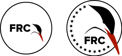
Over at the Freicoin comminuty forum there is a thread about a wish for a new logo for Freicoin. Inspired by Fedde who directed me to that thread and the thread itself, I put together the one below, and it's just a sketch, and needs more:
Another one is a variant of the two former ones, the coin-looking FF coin (the typography) and the Blue see-through Kria logo:
It works.
-
Great board!
Go Fedde!

-

New Freicoin logo?
in Project Suggestions
Posted
I strongly disagree. Being on top is a good thing and what we want to communicate. Being the stronger, the one in control, having the upper hand, constantly scanning the fields and seas below for prey. Looking up implies being cute, weak and begging. And a tern is hunting for fish all day long and that means looking down a lot.
You don't build a fort in a valley, but on a hill, in order to take advantage of gravity and get a birds view of things below, and be the ones on top, in control of the situation. Birds don't look up unless they are on the ground nesting or injured, and it is perhaps THE one sign of weakness in birds.
Birds looking up, and all I can think of is some poor bird who has too raise and feed a cuckoo chicken. This must be one of the very few times when a bird looking upwards is the one in power and control